Recent work for visualizing big graphs uses a proxy graph approach: the original graph is replaced by a proxy graph, which is much smaller than the original graph. The challenge for the proxy graph approach is to ensure that the proxy graph is a good representation of the original graph. However, previous work to compute proxy graphs using graph sampling techniques often fails to preserve connectivity and important global skeletal structure in the original graph.
This paper introduces two new families of proxy graph methods BCP-W and BCP-E, tightly integrating graph sampling methods with the BC (Block Cut-vertex) tree, which represents the decomposition of a graph into biconnected components. Experimental results using graph sampling quality metrics show that our new BC tree-based proxy graph methods produce significantly better results than existing sampling-based proxy graph methods: 25% improvement by BCP-W and 15% by BCP-E on average. We also present DBCP, a BC tree-based proxy graph method for distributed environment. Experiments on the Amazon Cloud EC2 demonstrate that DBCP is scalable for big graph data sets; runtime speed-up of 77% for distributed 5-server on average.
Visual comparison using a graph layout method and the proxy quality metrics confirm that our new BC tree-based proxy graph methods are significantly better than existing sampling-based proxy graph method. Our main results lead to guidelines for computing sampling-based proxy graphs for visualization of big graphs. Development of an Integrated Visualization System for Phenotype Character NetworksNote Yosuke Onoue (Kyoto University) Koji Kyoda (RIKEN) Miki Kioka (Kyoto University) Kazutaka Baba (Kyoto University) Shuichi Onami (RIKEN) Koji Koyamada (Kyoto University) Wet and dry biological data are potentially complementary. By visually integrating the initiation and developmental processes of organisms, we might reveal new causalities in biological data. Here we present an integrated visualization system for a causality network constructed from phenotypic developmental characters and their related scientific literature. To obtain the phenotypic characters, we applied bio-imaging informatics techniques to the data of wet experiments. The phenotypic character network was visually rendered in the CausalNet system, which provides both explanatory and verification visualization functions. Statistical analysis and scientific literature mining proved useful for determining the mechanisms underlying the phenotypic trait network. The validity of the system was confirmed in an application example and expert feedback on the developmental process of the nematode Caenorhabditis elegans. The discussed methodology is applicable to other multicellular organisms.
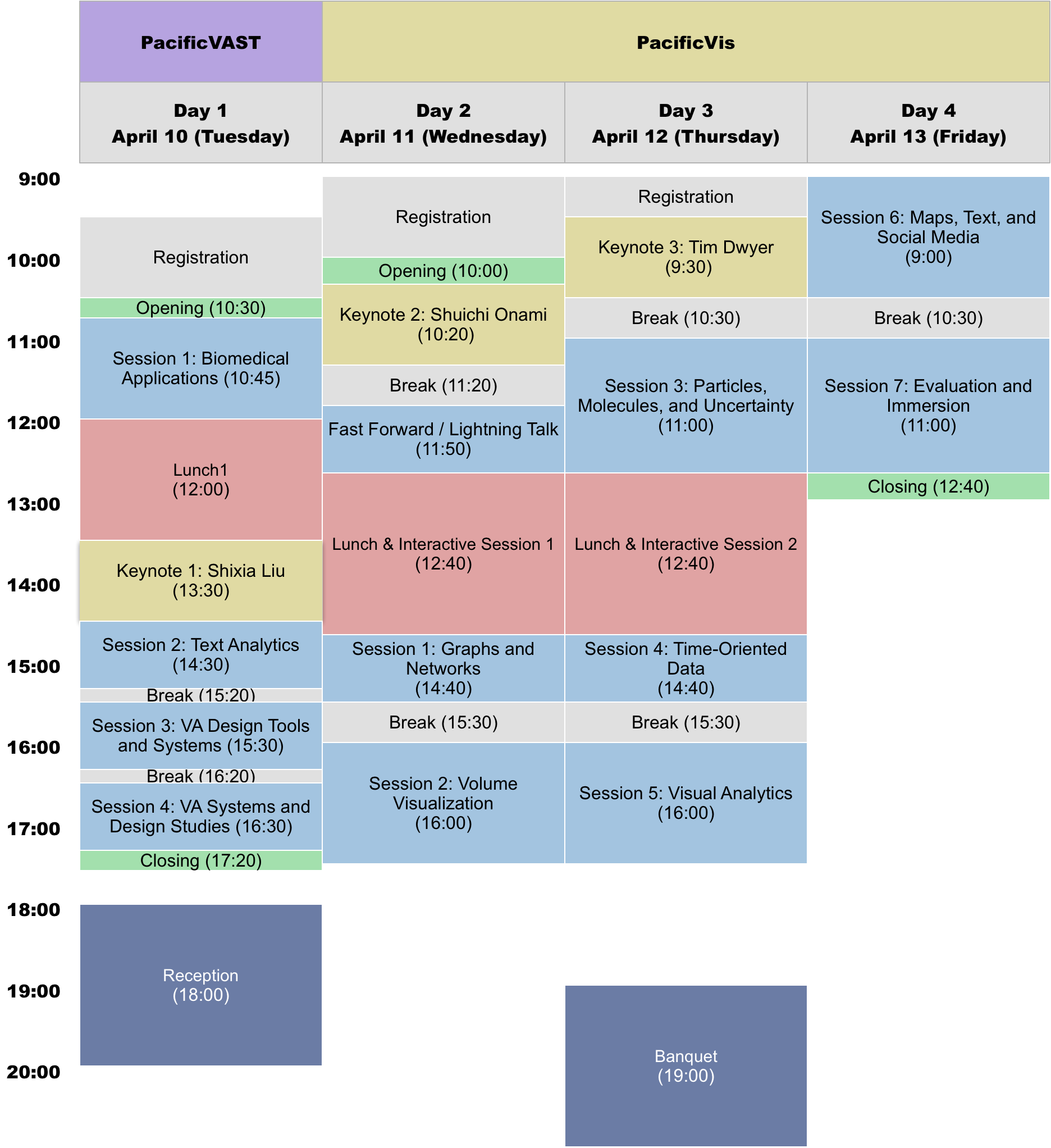
Session 2: Volume Visualization
April 11 (Wednesday) 16:00 Chair: Chuck Hansen (University of Utah)
Image and Distribution Based Volume Rendering for Large Data SetsPaper Ko-Chih Wang (The Ohio State University, United States) Naeem Shareef (The Ohio State University, United States) Han-Wei Shen (The Ohio State University, United States) Analyzing scientific datasets created from simulations on modern supercomputers is a daunting challenge due to the fast pace at which these datasets continue to grow. Low cost post analysis machines used by scientists to view and analyze these massive datasets are severely limited by their deficiencies in storage bandwidth, capacity, and computational power. Trying to simply move these datasets to these platforms is infeasible. Any approach to view and analyze these datasets on post analysis machines will have to effectively address the inevitable problem of data loss. Image based approaches are well suited for handling very large datasets on low cost platforms. Three challenges with these approaches are how to effectively represent the original data with minimal data loss, analyze the data in regards to transfer function exploration, which is a key analysis tool, and quantify the error from data loss during analysis. We present a novel image based approach using distributions to preserve data integrity. At each view sample, view dependent data is summarized at each pixel with distributions to define a compact proxy for the original dataset. We present this representation along with how to manipulate and render large scale datasets on post analysis machines. We show that our approach is a good trade off between rendering quality and interactive speed and provides uncertainty quantification for the information that is lost. Smart Surrogate Widgets for Direct Volume ManipulationPaper Sergej Stoppel (University of Bergen, Norway) Stefan Bruckner (University of Bergen, Norway) Interaction is an essential aspect in volume visualization, yet common manipulation tools such as bounding boxes or clipping plane widgets provide rather crude tools as they neglect the complex structure of the underlying data. In this paper, we introduce a novel volume interaction approach based on smart widgets that are automatically placed directly into the data in a visibility-driven manner. By adapting to what the user actually sees, they act as proxies that allow for goal-oriented modifications while still providing an intuitive set of simple operations that is easy to control. In particular, our method is well-suited for direct manipulation scenarios such as touch screens, where traditional user interface elements commonly exhibit limited utility. To evaluate out approach we conducted a qualitative user study with nine participants with various backgrounds. Topologically Controlled Lossy CompressionPaper Maxime Soler (Total S.A., France) Melanie Plainchault (Total SA, France) Bruno Conche (Total SA, France) Julien Tierny (CNRS LIP6, UPMC, Sorbonne Universites, France) This paper presents a new algorithm for the lossy compression of scalar data defined on 2D or 3D regular grids, with topological control. Certain techniques allow users to control the pointwise error induced by the compression. However, in many scenarios it is desirable to control in a similar way the preservation of higher-level notions, such as topological features, in order to provide guarantees on the outcome of post-hoc data analyses. This paper presents the first compression technique for scalar data which supports a strictly controlled loss of topological features. It provides users with specific guarantees both on the preservation of the important features and on the size of the smaller features destroyed during compression. In particular, we present a simple compression strategy based on a topologically adaptive quantization of the range. Our algorithm provides strong guarantees on the bottleneck distance between persistence diagrams of the input and decompressed data, specifically those associated with extrema. A simple extension of our strategy additionally enables a control on the pointwise error. We also show how to combine our approach with state-of-the-art compressors, to further improve the geometrical reconstruction. Extensive experiments, for comparable compression rates, demonstrate the superiority of our algorithm in terms of the preservation of topological features. We show the utility of our approach by illustrating the compatibility between the output of post-hoc topological data analysis pipelines, executed on the input and decompressed data, for simulated or acquired data sets. We also provide a lightweight VTK-based C++ implementation of our approach for reproduction purposes. Information Guided Data Sampling and Recovery using Bitmap IndexingPaper Tzu-Hsuan Wei (The Ohio State University, USA) Soumya Dutta (The Ohio State University, USA) Han-Wei Shen (The Ohio State University, United States) Creating a data representation is a common approach for efficient and effective data management and exploration. The compressed bitmap indexing is one of the emerging data representation used for large-scale data exploration. Performing sampling on the bitmapindexing based data representation allows further reduction of storage overhead and be more flexible to meet the requirements of different applications. In this paper, we propose two approaches to solve two potential limitations when exploring and visualizing the data using sampling-based bitmap indexing data representation. First, we propose an adaptive sampling approach called information guided stratified sampling (IGStS) for creating compact sampled datasets that preserves the important characteristics of the raw data. Furthermore, we propose a novel data recovery approach to reconstruct the irregular subsampled dataset into a volume dataset with regular grid structure for qualitative post-hoc data exploration and visualization. The quantitative and visual efficacy of our proposed data sampling and recovery approaches are demonstrated through multiple experiments and applications. Multiresolution Volume Filtering in the Tensor Compressed DomainTVCG Rafael Ballester-Ripoll (Department of Informatics, University of Zurich, Switzerland) David Steiner (Department of Informatics, University of Zurich, Switzerland) Renato Pajarola (Department of Informatics, University of Zurich, Switzerland) Signal processing and filter operations are important tools for visual data processing and analysis. Due to GPU memory and bandwidth limitations, it is challenging to apply complex filter operators to large-scale volume data interactively. We propose a novel and fast multiscale compression-domain volume filtering approach integrated into an interactive multiresolution volume visualization framework. In our approach, the raw volume data is decomposed offline into a compact hierarchical multiresolution tensor approximation model. We then demonstrate how convolution filter operators can effectively be applied in the compressed tensor approximation domain. To prevent aliasing due to multiresolution filtering, our solution (a) filters accurately at the full spatial volume resolution at a very low cost in the compressed domain, and (b) reconstructs and displays the filtered result at variable level-of-detail. The proposed system is scalable, allowing interactive display and filtering of large volume datasets that may exceed the available GPU memory. The desired filter kernel mask and size can be modified online, producing immediate visual results.
Session 3: Particles, Molecules, and Uncertainty
April 12 (Thursday) 11:00 Chair: Barbora Kozlíková (Masaryk University)
In Situ Prediction Driven Feature Analysis in Jet Engine SimulationsPaper Soumya Dutta (The Ohio State University, United States) Han-Wei Shen (The Ohio State University, United States) Jenping Chen (The Ohio State University, United States) Efficient feature exploration in large-scale data sets using traditional post-hoc analysis approaches is becoming prohibitive due to the bottleneck stemming from I/O and output data sizes. This problem becomes more challenging when an ensemble of simulations are required to run for studying the influence of input parameters on the model output. As a result, scientists are inclining more towards analyzing the data in situ while it resides in the memory. In situ analysis aims at minimizing expensive data movement while maximizing the resource utilization for extraction of important information from the data. In this work, we study the evolution of rotating stall in jet engines using data generated from a large-scale flow simulation under various input conditions. Since the features of interest lack a precise descriptor, we adopt a fuzzy rule-based machine learning algorithm for efficient and robust extraction of such features. For scalable exploration, we advocate for an off-line learning and in situ prediction driven strategy that facilitates in-depth study of the stall. Task-specific information estimated in situ is visualized interactively during the post-hoc analysis revealing important details about the inception and evolution of stall. We verify and validate our method through comprehensive expert evaluation demonstrating the efficacy of our approach. Access Pattern Learning with Long Short-term Memory for Parallel Particle TracingPaper Fan Hong (Peking University, China) Jiang Zhang (Peking University, China) Xiaoru Yuan (Peking University, China) In this work, we present a novel access pattern estimation approach for parallel particle tracing in flow field visualization based on deep neural networks. With strong generalization ability, we develop a Long Short-term Memory (LSTM)-based model, which is capable of learning accurate access patterns with only a few training samples and representing the learned patterns with small storage overhead. Equipped with prediction and prefetching functions driven by the developed model, our parallel particle tracing framework employs CPUs and GPUs together for particle tracing tasks. We demonstrate the accuracy and time efficiency of our approach with various flow visualization applications in three different flow datasets. Dynamic Data Repartitioning for Load-Balanced Parallel Particle TracingPaper Jiang Zhang (Peking University, China) Hanqi Guo (Argonne National Laboratory, United States) Xiaoru Yuan (Peking University, China) Tom Peterka (Argonne National Laboratory, United States) We present a novel dynamic load-balancing algorithm based on data repartitioning for parallel particle tracing in flow visualization. Instead of static data assignment, we dynamically repartition the data into blocks and reassign the blocks to processes to balance the workload distribution among the processes. Block repartitioning is performed based on a dynamic workload estimation method that predicts the workload in the flow field on the fly as the input. In our approach, we allow data duplication in the repartitioning, enabling the same data blocks to be assigned to multiple processes. Load balance is achieved by regularly exchanging the blocks (together with the particles in the blocks) among processes according to the output of the data repartitioning. Compared with other load-balancing algorithms, our approach does not need any preprocessing on the raw data and does not require any dedicated process for work scheduling, while it has the capability to balance uneven workload efficiently. Results show improved load balance and high efficiency of our method on tracing particles in both steady and unsteady flow. Uncertainty Visualization for Secondary Structures of ProteinsPaper Christoph Schulz (University of Stuttgart, Germany) Karsten Schatz (University of Stuttgart, Germany) Michael Krone (University of Stuttgart, Germany) Matthias Braun (University of Stuttgart, Germany) Thomas Ertl (University of Stuttgart, Germany) Daniel Weiskopf (University of Stuttgart, Germany) We present a technique that conveys the uncertainty in the secondary structure of proteins-an abstraction model based on atomic coordinates. While protein data inherently contains uncertainty due to the acquisition method or the simulation algorithm, we argue that it is also worth investigating uncertainty induced by analysis algorithms that precede visualization. Our technique helps researchers investigate differences between multiple secondary structure assignment methods. We modify established algorithms for fuzzy classification and introduce a discrepancy-based approach to project an ensemble of sequences to a single importance-weighted sequence. In 2D, we depict the aggregated secondary structure assignments based on the per-residue deviation in a collapsible sequence diagram. In 3D, we extend the ribbon diagram using visual variables such as transparency, wave form, frequency, or amplitude to facilitate qualitative analysis of uncertainty. We evaluated the effectiveness and acceptance of our technique through expert reviews using two example applications: the combined assignment against established algorithms and time-dependent structural changes originating from simulated protein dynamics. Modeling and Visualization of Uncertainty-aware Geometries using Multi-variate Normal DistributionsNote Christina Gillmann (University of Kaiserslautern, Kaiserslauten, Rheinland-Pfalz, Germany) Thomas Wischgoll (Wright State University, Dayton, Ohio, United States) Bernd Hamann (University of California, Davis, Davis, California, U.S.A.) James Ahrens (Los Alamos National Laboratory, Los Alamos, New Mexico, United States) Many applications are dealing with geometric data that are affected by uncertainty. It is important to analyze, visualize, and understand the properties of uncertain geometry. We present a methodology to model uncertain geometry based on multi-variate normal distributions. In addition, we propose a visualization technique to represent a hull for uncertain geometry capturing a user-defined percentage of the underlying uncertain geometry. To show the effectiveness of our approach, we have modeled and visualized uncertain datasets from different applications. Visualization of Fullerene FragmentationNote Kai Sdeo (Heidelberg University, 69120 Heidelberg, Baden-Wuerttemberg, Germany) Bastian Rieck (Heidelberg University, 69120 Heidelberg, Baden-Wuerttemberg, Germany) Filip Sadlo (Heidelberg University, 69120 Heidelberg, Baden-Wuerttemberg, Germany) In this paper, we present a novel visualization approach for the analysis of fragmentation of molecules, with a particular focus on fullerenes. Our approach consists of different components at different levels of detail. Whereas one component is geometric but invariant to rotations, two other components are based on the topological structure of the molecules and thus additionally invariant to deformations. By combining these three components, which aim at the analysis of simulation ensembles of such molecules, and complementing them with a space–time representation that enables detailed interactive inspection of individual simulations, we obtain a versatile tool for the analysis of the fragmentation of structured, symmetrical molecules such as fullerenes. We exemplify the utility of our approach using a tightly coupled simulation approach for the dynamics of fullerenes.
Interactive Session 2:
April 12 (Thursday) 12:40 Proposal of visual analytics interface for time series data employing trajectory manipulationPoster Rei Takami (Tokyo Metropolitan University, Japan) Yasufumi Takama (Tokyo Metropolitan University, Japan) Recently, various time series data have been collected in many fields, and visual analytics interface is expected to be useful for utilizing such data. However, several issues arising from the property of time series data should be considered when developing a visual analytics interface. For example, when time series data is visualized using animation, collision would occur between movement of time series data itself and movement caused by interaction with users. In order to solve those issues, this paper proposes a visual analytics interface for time series data based on trajectory manipulation, which can handle temporal and spatial changes uniformly. A part of the experimental results with test participants is reported in the paper. A Visualization System for Data Anomaly Detection in IoT ApplicationsPoster Fan Zhao (Xinjiang Technical Institute of Physics and Chemistry,Chinese Academy of Sciences, China) TongHai Jiang (Xinjiang Technical Institute of Physics and Chemistry,Chinese Academy of Sciences, China) Li Cheng (Xinjiang Technical Institute of Physics and Chemistry,Chinese Academy of Sciences, China) Analysis on urban vehicle behavior patterns has increasingly drawn researcher’s attention due to its importance in transportation, urban management and public safety. Among various available vehicle activity data, drivers’ refueling behavior is particularly important in the context of public safety. In this research, we develop an interactive visualization analysis system which can be applied in abnormal behavior detection for public safety monitoring agencies. Through the analysis of gas stations, vehicles and drivers, we extract proper features and generalize common refueling behavior patterns for a province-wide region. We adopt five different visualization models which take various data features and patterns into account, including sparse feature, geospatial-temporal feature and multi-dimensional feature. Our visualization system supports interactive user operations to retrieve, display and analyze individual or group vehicle behaviors. Users can further obtain the statistical group features and typical individual behavior patterns in order to identify abnormal events. Experiment results strongly supports the validity and practical feasibility of our system in the domain of public safety monitoring. The Integration of Visual and Haptic Impressions Felt from Synthetic Resin TexturePoster Taishi Fujiwara (Kwansei Gakuin University, Japan) Atsushi Takemoto (Kwansei Gakuin University, Japan) Yusuke TANI (Kwansei Gakuin University, Japan) Kensuke Tobitani (Kwansei Gakuin University, Japan) Noriko Nagata (Kwansei Gakuin University, Japan) The ability of texture perception is important to estimate the materials and properties of objects. However, the ways how multimodal information can be applied to texture recognition has yet to be fully elucidated. In this research study, we modeled the relationship among visual, haptic, and visuo-haptic impressions using multiple-regressions analysis. Some of the models demonstrated that the product of scored visual and haptic impressions plays an important role in multimodal texture perception. This result suggests that a multimodal texture perception can greatly change the impressions of texture more than we imagined. 3D Visualization of Versioning GraphPoster Ko Fujimura (Otsuma Women’s University, Japan) This paper proposes modeling of development processes in cooperative work as a versioning graph that consists of contribution edges and update edges. This modeling is suitable for visualizing the process as animation in which new nodes and edges are added to the scene over time. This paper also presents the basic idea of the visualizing method of the versioning graph in 3D space. We found that 3D representation is suitable for understanding the process of the development of the cooperative work. We implemented this visualization method and applied to some open source communities. This tool, GitVis3D, and its demonstration are available from our git repository. Visualization of diffusion behavior patterns on TwitterPoster Chisae Iwashina (Ochanomizu University , Japan) Mitsuo Yoshida (Toyohashi University of Technology, Japan) Takayuki Itoh (Ochanomizu University, Japan) There is the increasing number of examples of using SNS that is used as information transmission tool for the purpose of spreading information by organizations and individuals. Among SNSs, Twitter is particularly known to be able to spread out easily (retweet), its use is still active. Entertainers, fashion brands, enterprises and others use this function to notify information. Therefore, there are influential users of various genres on Twitter. One of the major reasons that these users exist is that there are many users who spread information (retweets). In this study, we focused attention on users who have influential users and expressed the relationship between the tweet group of the influential users and the surrounding user group by a visualization method using dendrogram and heat map. As to the nature of information spreading, it is found that the surrounding user layer and the number of people who react in relation to tweet content and tweet time are changed by considering both tweet contents and surrounding user ’s aspects. SeqTextVis: A Distributed Word Representation Learning for Time Sequential Text Data VisualizationPoster Jheng-Long Wu (Chinese Culture University, Taiwan; Chinese Culture University, Taipei, Taiwan) Mu-Hui Yu (National Taiwan University, Taiwan; National Taiwan University, Taipei, Taiwan) Texts contain both implicit and explicit information. Explicit info can be easily observed and explored from co-occurrence matrix in text while finding and retrieving implicit info from raw text is very difficult, especially on time sequential text data. However, extracting both explicit and implicit info is important because it helps in explaining overall hidden relations among texts. In this paper, we propose SeqTextVis, a new method to learn from time sequential text data, and visualize explicit and implicit info based on distributed word representation learning methods: word2vec and node2vec. Word2vec, which is similar to co-occurrence approach, is a simple way to learn neighbor relations and extract explicit info; node2vec can extract implicit info by learning parsed structures. SeqTextVis combines with both advantages and time-decay feature to make dynamic graphs of both explicit and implicit relations chronologically. We used case study to explain correctness and effectiveness for SeqTextVis system evaluation. Visual Analysis of the Cut-Point in Urban Public ServicePoster Lin Zhu (Tianjin University, China) Ye Yuan (Tianjin University, China) Chongke Bi (Tianjin University, China) Urban public service has become a very important research topic in smart city. Local governments will set up some non-profit or profit-making organizations to provide citizens with convenient and efficient public services. These institutions usually include: water, heating, gas, taxi, bus, subway and so on. However, citizens encounter various problems in their daily lives and face great challenges in seeking the services of these organizations. Due to the lack of understanding of departmental functions and relationships, citizens cannot find a problem-solving department quickly and accurately after encountering problems. This would lead to slow or even unsolvable problems and seriously affect the quality of civic life. In this poster, we proposed a cut-point based visualization scheme for urban public service. The basic idea is to use this visualization scheme to help citizens quickly find the problem-solving departments, shorten the time to solve the problem, and improve the quality of civic life. Visual Style Exploration in Well-designed DiagramsPoster Min Lu (ShenZhen University, China) Nowadays there are numerous diagrams in good style designed by artists available online, which can serve as the reference to the visualization design. In this work, we present a visual analytic system to explore well-designed diagrams collected from Infographics, which support users to retrieve diagrams with specified styler features. Currently we consider the global style features, such as Histogram of Gradients, color histograms, etc. Meanwhile, with image processing method, diagrams are decomposed into visual elements, for each of which localized style features will be computed in next step. With the query interface, users are support to query diagrams with both globally and locally specified style features. Lastly, we demonstrate the effectiveness of the method by two global query cases Cell nucleus visualization with phenotypic characteristicsPoster Sayaka Nagai (Kobe University, Japan) Naohisa Sakamoto (Kobe University, Japan) Koji Kyoda (RIKEN Quantitative Biology Center, Japan) Shuichi Onami (RIKEN Quantitative Biology Center, Japan) For elucidating the developmental mechanism of multicellular organisms, it is important to analyze the spatiotemporal features (phenotypic characteristics) of cells appearing during cell division and their correlation. Furthermore, in order to analyze how phenotypic characteristics correlate, it is necessary to observe cell nucleus shapes. We proposed a system that visualizes phenotypic characteristics and three-dimensional cell nucleus shapes before, but there were problems that cell nucleus shapes cannot be observed individually and information such as cell nuclear position or movement distance was insufficient. In order to solve such problems, we have improved visualization methods of cell nuclei and phenotypic characteristics. This improvement enabled us to analyze cell nucleus shapes and a nuclear position accurately. Information Integrated Visualization System for Heavy Rainfall Risk AnalysisPoster Masahiko Itoh (National Institute of Information and Communications Technology, Japan; The University of Tokyo, Tokyo, Japan) Takeshi Sagara (InfoProto Co.,Ltd., Japan) Ukyo Suzuki (Picolab Co., Ltd., Japan) Kazutoshi Umemoto (National Institute of Information and Communications Technology, Japan; The University of Tokyo, Tokyo, Japan) Naoki Yoshinaga (The University of Tokyo, Japan) Masashi Toyoda (The University of Tokyo, Japan) Koji Zettsu (National Institute of Information and Communications Technology, Japan) Yutaka Kidawara (National Institute of Information and Communications Technology, Japan) This paper proposes an information integrated visualization system for heavy rainfall risk analysis. It utilizes multiple sensor data, such as weather data obtained from two kinds of weather radars and event information extracted from Twitter data, and visualizes the extracted risks from each sensor data. We show the effectiveness of the system by demonstrating a case study where a risky situation caused by a typhoon was analyzed using real data. The visualization results show the typhoon caused many problems, some of which continued after the downpour. Our visualization system is useful to judge risks that cannot be understood by visualization of only one kind of data. Tsunami Evacuation Behavior Simulation using Agents of Game EnginePoster Yasuo Kawai (Bunkyo University, Japan) Yurie Kaizu (Bunkyo University, Japan) Kenta Kawahara (Bunkyo University, Japan) Youhei Obuchi (Bunkyo University, Japan) Satoshi Otsuka (Bunkyo University, Japan) Shiori Tomimatsu (Bunkyo University, Japan) This study provides an evacuation behavior simulation system at the time of tsunami using the evacuation agent of a game engine. The tsunami evacuation behavior simulation system is a system that enables local governments and residents to work together to formulate disaster prevention plans. As a representation of a simple tsunami, in this system, a slightly oblique plane is inserted as the sea surface to a three-dimensional model of the terrain, building, and road, which is generated by geographical information system data. Mass agents of evacuees randomly placed on the road will move toward the nearest wide evacuation shelter or tsunami evacuation building. As a result, it was found that serious damage will occur even at a tsunami height of 10 m. To Make Graphs Such As Scatter Plots Numerically ReadablePoster Toshiyuki Shimono (Digital Garage, Inc., JAPAN) Different-sized discrete crosses placed in an organized lattice pattern can assist the human eyes to read numerical values on statistical graphs, enabling more precise interpretation and enlarging the utility of statistical graphs that visually represent numerical quantities. This paper presents a novel graph-plotting method that places roughly ten thousand separate grids on a graph, providing human data analysis with an easy access to arbitrary numerical readouts from a statistical graph. At present, this functionality has been lacking in the existing graph-plotting software. Massive Climate Data Visualization for Making Adaptation PoliciesPoster Yosuke Onoue (Kyoto University, Japan) Takao Naito (Kyoto University, Japan) Yujin Nakagawa (JAMSTEC, Japan) Fumiaki Araki (JAMSTEC, Japan) Koji KOYAMADA (Kyoto University, Japan) In making climate change adaptation policies, the importance of effective methods for extracting and visualizing data for large-scale ensemble climate simulation is increasing. For that purpose, a novel data handling approach for such ensemble climate simulation data is necessary. In this study, we present an efficient visualization system for exploring the ensemble climate simulation data. The proposed system provides a data handling method based on a relational database. Users can easily retrieve data which are required for research and decision making with the proposed system. We show an application example to demonstrate the effectiveness of the proposed system. TextTimeline: Visualizing Acoustic Features and Vocalized Timing along Display TextPoster Tomoyasu Nakano (National Institute of Advanced Industrial Science and Technology (AIST), Japan) Jun Kato (National Institute of Advanced Industrial Science and Technology (AIST), Japan) Masataka Goto (National Institute of Advanced Industrial Science and Technology (AIST), Japan) We propose a novel interface, called TextTimeline, that visualizes acoustic features (e.g., intensity), the timing of each word, and each word’s time length (duration) along its displayed text. Although there were interfaces that visualized acoustic features of utterances with associated text and displayed those features at the position of the text, the time axis of utterance was nonlinearly stretched according to the width of the displayed text, and the duration information was lost. TextTimeline visualizes the duration of each word while maintaining the width of the corresponding text. To visualize the acoustic features of each syllable, in addition to the text that is written horizontally, a vertical (orthogonally oriented) axis is added as a sound timeline. This is an interface that makes it possible to visualize the utterance style in detail while giving priority to text display. Expert Team Mining and VisualizationPoster Yang Wang (Computer Network Information Center, Chinese Acadamy of Sciences, China) Minzhu Yu (Computer Network Information Center, Chinese Acadamy of Sciences, China) Guihua Shan (Computer Network Information Center, Chines Academy of Sciences, China) Yifei An (Ocean University of China, China) Xiaoxiao Yang (University of Chinese Academy of Sciences, China) Expert team mining and visualization is a fundamental process in team competitiveness analysis and an effective tool for investors to choose investee research teams. In this paper, we discover experts in different institutes and research fields. Then we propose an algorithm to mine expert teams among co-authors and employ adjacent matrix to visualize co-author relationship and expert teams. Subsequently, we visualize the relationship among expert team members, their papers and affiliations. Finally, a visualization system is implemented for expert team analysis.
Visual Data Storytelling Contest #2
Learning About Disease Associations in Taiwan Contest
Keshav Dasu (University of California Davis) Suyun Bae (University of California Davis) Takanori Fujiwara (University of California Davis) Kwan-Liu Ma (University of California Davis)
We analyzed the data from Taiwan’s National Health Insurance Research Database (NHIRDB). It is stratified into ten age groups, and for each group the likelihood of disease B contracted from disease A is calculated. We depict the disease association among the studied subjects by designing a visualization that allows us to answer questions, such as “If I have heart-failure what else am I susceptible to?” and “How does age play a role?” Our visualization is modeled after a virus cell-based. This visualization illustrates the co-occurrence of diseases. The nucleus size denotes the number of diseases that are associated. Each flagellum represents another disease category. Longer length of the flagellum represents a stronger association. The thickness of a flagellum represents the number of diseases with the same association at a given point. Fluctuation of a flagellum shows variation in the strength of association.
A Visualization of Two-stage Autoignition of n-dodecane Contest
Yucong Ye (University of California Davis)Min Shih (University of California Davis) Franz Sauer (University of California Davis) Kwan-Liu Ma (University of California Davis)Giulio Borghes (Sandia National Laboratories)Alexander Krisman (Sandia National Laboratories)Jacqueline Chen (Sandia National Laboratories)
This animation of ignition in a combustion engine was made through consultations with domain scientists to help develop the story. It uses large multivariate time-varying volumetric data requiring significant effort in data preprocessing, volume rendering, and video processing. A dedicated volume rendering pipeline was developed to enable compositing of multiple variables, modulating opacity through distance functions to reduce clutter, and stretching volumes to emphasize regions of interest. In addition, the appearance of each variable was carefully designed with scientists to match the impression of its physical properties. Although there are hundreds of timesteps, the frequency is too low for a smooth animation, so we utilize optical flow to interpolate between frames in image space. To help provide context, an animation of a diesel engine was made using the Blender 3D software.
Perfume Explorer: What Kind of Perfume Do People Prefer? What Is Suitable Perfume for Me? Contest
Dongyeong Lee (Ajou University)Yeji Jeong (Ajou University)Hyunsu Park (Ajou University)Joonsun Hwang (Ajou University)Kyungwon Lee (Ajou University)
We tried to express aesthetic elements such as fragrance through data. By collecting subjective evaluation data for over 1000 popular perfumes, we have found a specific pattern. To effectively see at a glance, we visualized a large amount of perfume data using ‘Concentric Radviz’. We categorized perfume data into four dimensions: season, weight, persistence, and base material and assigned each to a circle. The coordinates of the node in the concentric circle is determined by the spring force, which is assigned to each circular dimension anchor. Based on existing studies, we achieved our initial goal of visualization and then made various attempts to make data classification and exploration easier. From this, users will not only be able to find their own perfume, but users will also be able to learn the general characteristics of perfume.
The diverging paths of Hilda Geiringer and Leonore Brecher during WWII Contest
Michail Schwab (Northeastern University)Aditeya Pandey (Northeastern University)John Wihbey (Northeastern University)Laurel Leff (Northeastern University)Michelle Borkin (Northeastern University)“Rediscovering the Refugee Scholars” is a research effort by Northeastern University researchers in Jewish Studies, Journalism, Public History, and Computer Science to retrace the forgotten career and life pathways of a group of scholars who attempted to flee Nazi persecution. Over 5,000 scholars, including 80 female scientists and mathematicians, sought the help of the Emergency Committee in Aid of Displaced Foreign Scholars based in New York. The committee eventually aided scholars throughout Nazi-controlled Europe. With the assistance of the New York Public Library, we have examined, digitized, and analyzed the archival files of the female science and mathematics scholars’ applications to the Emergency Committee, and compiled a story about two of their many fates at https://intervis-projects.ccs.neu.edu/refugeescholars-story/. We utilized our novel javascript web-based tool Storytimeline, combining geotemporal data, text and images into a coherent narrative visualization. Storytimeline supports author-curated non-linear story telling with a highlighted, multifaceted timeline.
Session 4: Time-Oriented Data
April 12 (Thursday) 14:40 Chair: Fabian Beck (University of Stuttgart)
Composite Visual Mapping for Time Series VisualizationPaper Ali Jabbari (Univ. Grenoble Alpes, LIG, F-38000, France) Renaud Blanch (Univ. Grenoble Alpes, LIG, France) Sophie Dupuy-Chessa (Univ. Grenoble Alpes, LIG, F-38000, France) In the information visualization reference model, visual mapping is the most crucial step in producing a visualization from a data set. The conventional visual mapping maps each data attribute onto a single visual channel (e.g. the year of production of a car to the position on the horizontal axis). In this work, we investigate composite visual mapping: mapping single data attributes onto several visual channels, each one representing one aspect of the data attribute (e.g. its order of magnitude, or its trend component). We first propose a table which allows us to explore the design space of composite mappings by offering a systematic overview of channel combinations. We expect that using more than one visual channel for communicating a data attribute increases the bandwidth of information presentation by displaying separable information on different aspects of data. In order to evaluate this point, we compare horizon graph, an existing technique which successfully adopts a composite visual mapping, with a selection of alternative composite mappings. We show that some of those mappings perform as well as –and in some cases even better than– horizon graph in terms of accuracy and speed. Our results confirm that the benefits of composite visual mapping are not limited to horizon graph. We thus recommend the use of composite visual mapping when users are simultaneously interested in several aspects of data attributes. Visual Detection of Structural Changes in Time-Varying Graphs Using Persistent HomologyPaper Mustafa Hajij (University of South Florida, United States) Bei Wang (Scientific Computing and Imaging Institute, University of Utah, United States) Carlos Scheidegger (The University of Arizona, United States) Paul Rosen (University of South Florida, USA) Topological data analysis is an emerging area in exploratory data analysis and data mining. Its main tool, persistent homology, has become a popular technique to study the structure of complex, high-dimensional data. In this paper, we propose a novel method using persistent homology to quantify structural changes in time-varying graphs. Specifically, we transform each instance of the time-varying graph into a metric space, extract topological features using persistent homology, and compare those features over time. We provide a visualization that assists in time-varying graph exploration and helps to identify patterns of behavior within the data. To validate our approach, we conduct several case studies on real-world datasets and show how our method can find cyclic patterns, deviations from those patterns, and one-time events in time-varying graphs. We also examine whether a persistence-based similarity measure satisfies a set of well-established, desirable properties for graph metrics. Optimal Sankey Diagrams via Integer ProgrammingNote David Cheng Zarate (Monash University) Pierre Le Bodic (Monash University) Tim Dwyer (Monash University) Graeme Gange (University of Melbourne) Peter Stuckey (University of Melbourne) We present the first practical Integer Linear Programming model for Sankey Diagram layout. We show that this approach is viable in terms of running time for reasonably complex diagrams (e.g. more than 50 nodes and 100 edges) and also that the quality of the layout is measurably and visibly better than heuristic approaches in terms of crossing reduction. Finally, we demonstrate that the model is easily extensible (compared to complex heuristics) through the addition of constraints, such as arbitrary grouping of nodes.
Session 5: Visual Analytics
April 12 (Thursday), 16:00 Chair: Jinwook Seo (Seoul National University)
A Visual Analytics Approach for Equipment Condition Monitoring in Smart Factories of Process IndustryPaper Wenchao Wu (Siemens Corporate Technology, China) Yixian Zheng (China Telecom Shanghai Ideal Information Industry (Group) Co.,Ltd, China; Shanghai Engineering Research Center of Internet Big Data, Shanghai, China) Kaiyuan Chen (University of California, Los Angeles, United States) Xiangyu Wang (University of Southern California, United States) Nan Cao (Tongji University, China; New York University , Shanghai, China) Monitoring equipment conditions is of great value in manufacturing, which can not only reduce unplanned downtime by early detecting anomalies of equipment but also avoid unnecessary routine maintenance. With the coming era of Industry 4.0 (or industrial internet), more and more assets and machines in plants are equipped with various sensors and information systems, which brings an unprecedented opportunity to capture large-scale and fine-grained data for effective on-line equipment condition monitoring. However, due to the lack of systematic methods, analysts still find it challenging to carry out efficient analyses and extract valuable information from the mass volume of data collected, especially for process industry (e.g., a petrochemical plant) with complex manufacturing procedures. In this paper, we report the design and implementation of an interactive visual analytics system, which helps managers and operators at manufacturing sites leverage their domain knowledge and apply substantial human judgements to guide the automated analytical approaches, thus generating understandable and trustable results for real-world applications. Our system integrates advanced analytical algorithms (e.g., Gaussian mixture model with a Bayesian framework) and intuitive visualization designs to provide a comprehensive and adaptive semi-supervised solution to equipment condition monitoring. The example use cases based on a real-world manufacturing dataset and interviews with domain experts demonstrate the effectiveness of our system. GANViz: A Visual Analytics Approach to Understand the Adversarial GamePaper Junpeng Wang (The Ohio State University, United States) Liang Gou (Visa Research, United States) Hao Yang (Visa Research, United States) Han-Wei Shen (The Ohio State University, United States) Generative models bear promising implications to learn data representations in an unsupervised fashion with deep learning. Generative Adversarial Nets (GAN) is one of the most popular frameworks in this arena. Despite the promising results from different types of GANs, in-depth understanding on the adversarial training process of the models remains a challenge to domain experts. The complexity and the potential long-time training process of the models make it hard to evaluate, interpret, and optimize them. In this work, guided by practical needs from domain experts, we design and develop a visual analytics system, GANViz, aiming to help experts understand the adversarial process of GANs in-depth. Specifically, GANViz evaluates the model performance of two subnetworks of GANs, provides evidence and interpretations of the models’ performance, and empowers comparative analysis with the evidence. Through our case studies with two real-world datasets, we demonstrate that GANViz can provide useful insight into helping domain experts understand, interpret, evaluate, and potentially improve GAN models. Visual Analysis of Collective Anomalies Through High-Order Correlation GraphPaper Jun Tao (University of Notre Dame, United States) Lei Shi (Institute of Software, Chinese Academy of Sciences, Beijing, China, China) Zhou ZHUANG (Fudan University, China) Congcong Huang (Chinese Academy of Sciences, China) Rulei Yu (Institute of Software, Chinese Academy of Sciences, China) Purui Su (Chinese Academy of Sciences, China) Chaoli Wang (University of Notre Dame, United States) Yang Chen (Fudan University, China) Detecting, analyzing and reasoning collective anomalies is important for many real-life application domains such as facility monitoring, software analysis and security. The main challenges include the overwhelming number of low-risk events and their multifaceted relationships which form the collective anomaly, the diversity in various data and anomaly types, and the difficulty to incorporate domain knowledge in the anomaly analysis process. In this paper, we propose a novel concept of high-order correlation graph (HOCG). Compared with the previous correlation graph definition, HOCG achieves better user interactivity, computational scalability, and domain generality through synthesizing heterogeneous types of nodes, attributes, and multifaceted relationships in a single graph. We design elaborate visual metaphors, interaction models, and the coordinated multiple view based interface to allow users to fully unleash the visual analytics power over HOCG. We conduct case studies in two real-life application domains, i.e., facility monitoring and software analysis. The results demonstrate the effectiveness of HOCG in the overview of point anomalies, detection of collective anomalies, and reasoning process of root cause analysis. Visual analytics for networked-guarantee loans risk managementPaper Zhibin Niu (School of computer software, Tianjin University, China) Dawei cheng (Department of Computer Science and Engineering, Shanghai Jiao Tong University,, China) Liqing Zhang (Department of Computer Science and Engineering, Shanghai Jiao Tong University, China) Jiawan Zhang (School of Computer Software, Tianjin University, China) Groups of enterprises can guarantee each other and form complex networks in order to try to obtain loans from banks. Monitoring the financial status of a network, and preventing or reducing systematic risk in case of a crisis, is an area of great concern for the regulatory commission and for the banks. We set the ultimate goal of developing a visual analytic approach and tool for risk dissolving and decision-making. We have consolidated four main analysis tasks conducted by financial experts: i) Multi-faceted Default Risk Visualization, whereby a hybrid representation is devised to predict the default risk and an interface developed to visualize key indicators; ii) Risk Guarantee Patterns Discovery. We follow the Shneiderman mantra guidance for designing interactive visualization applications, whereby an interactive risk guarantee community detection and a motif detection based risk guarantee pattern discovery approach are described; iii) Network Evolution and Retrospective, whereby animation is used to help users to understand the guarantee dynamic; iv) Risk Communication Analysis. The temporal diffusion path analysis can be useful for the government and banks to monitor the spread of the default status. It also provides insight for taking precautionary measures to prevent and dissolve systematic financial risk. We implement the system with case studies using real-world bank loan data. Two financial experts are consulted to endorse the developed tool. To the best of our knowledge, this is the first visual analytics tool developed to explore networked-guarantee loan risks in a systematic manner. FraudVis: Understanding Unsupervised Fraud Detection AlgorithmsNote Jiao Sun (Tsinghua University, Beijing, Beijing, China) Qixin Zhu (Tsinghua University, Beijing, Beijing, China) Zhifei Liu (Tsinghua University, Beijing, Beijing, China) Xin Liu (Tsinghua University, Beijing, Beijing, China) Yueming Wang (Tsinghua University, Beijing, Beijing, China) Jihae Lee (Tsinghua University, Beijing, Beijing, China) Shengdong Yang (Tsinghua University, Beijing, Beijing, China) Lei Shi (Institute of Software, Chinese Academy of Sciences, Beijing, Beijing, China) Ling Huang (Tsinghua University, Beijing, Beijing, China) Wei Xu (Tsinghua University, Beijing, Beijing, China) Discovering fraud user behaviors is vital to keep online websites healthy. Fraud behaviors usually exhibit grouping behaviors, and researchers have effectively leveraged this behavior to design unsupervised algorithms to detect fraud user groups. In this work, we propose a visualization system, namely FraudVis, to visually analyze the unsupervised fraud detection algorithm from temporal, intra-group correlation, inter-group correlation, feature selection, and the individual user perspectives. Our system helps domain experts better understand the algorithm output and the detected fraud behaviors. Meanwhile, FraudVis also helps algorithm experts to fine-tune the algorithm design through visual comparison. By using the visualization system, we solve two real world cases on fraud detection, one for a social video website and another for an e-commercial website. The result on both cases demonstrate the effectiveness of FraudVis in understanding unsupervised fraud detection algorithms. HeloVis : a Helicoidal Visualization for SIGINT Analysis using 3D immersionNote Alma Cantu (IMT Atlantique, Brest, France; Lab-STICC, Brest, France) Olivier Grisvard (IMT Atlantique, Brest, France; Lab-STICC, Brest, France) Thierry Duval (IMT Atlantique, Brest, France; Lab-STICC, Brest, France) Gilles Coppin (IMT Atlantique, Brest, France; Lab-STICC, Brest, France) In this paper we present HeloVis: a 3D interactive visualization that relies on immersive properties to improve the user performance during SIGINT analysis. SIGINT, which stands for SIGnal INTelligence, is a field facing many challenges like huge amount of data, complex data and novice users. HeloVis draws on perceptive biases, highlighted by Gestalt laws, and on depth perception to enhance the recurrence properties contained into the data and to abstract from interferences such as noise or missing data. In this paper, we first present SIGINT and the challenges that it brings to visual analytics. Then, we present the existing work that is currently used or that fits the SIGINT context. Finally, we present HeloVis, an innovative application on immersive context that allows performing SIGINT analysis and we present its evaluation performed with military operators who are the targeted end-users of SIGINT analysis.
Session 6: Maps, Text, and Social Media
April 13 (Friday), 9:00 Chair: Xiaoru Yuan (Peking University)
Visual Interactive Map MatchingPaper Robert Krueger (Institute for Visualization and Interactive Systems, University of Stuttgart, Germany) Georgi Simeonov (Institute for Visualization and Interactive Systems, Germany) Fabian Beck (paluno, University of Duisburg-Essen, Germany) Thomas Ertl (Institute for Visualization and Interactive Systems (VIS), Germany) Map matching is the process of assigning observed geographic positions of vehicles and their trajectories to the actual road links in a road network. In this paper, we present Visual Interactive Map Matching, a visual analytics approach to fine-tune the data preprocessing and matching process. It is based on ST-matching, a state-of-the-art and easy-to-understand map matching algorithm. Parameters of the preprocessing step and algorithm can be optimized with immediate visual feedback. Visualizations show current matching issues and performance metrics on a map and in diagrams. Manual and computer-supported editing of the road network model leads to a refined alignment of trajectories and roads. We demonstrate our approach with large-scale taxi trajectory data. We show that optimizing the matching on a subsample results in considerably improved matching quality, also when later scaled to the full dataset. An optimized matching ensures data faithfulness and prevents misinterpretation when the matched data might be investigated in follow-up analysis. MeetingVis: Visual Narratives to Assist in Recalling Meeting Context and ContentPaper Yang Shi (IDVX Lab, College of Design and Innovation, Tongji University, China) Chris Bryan (University of California-Davis, United States) Sridatt Bhamidipati (University of California, Davis, United States) Ying Zhao (Central south university, China) Yaoxue Zhang (University of Central South University, China) Kwan-Liu Ma (University of California, Davis, United States) content from a previously held meeting can lead to better planning and preparation. However, ineffective meeting summaries can impair this process, especially when participants have difficulty remembering what was said and what its context was. To assist with this process, we introduce MeetingVis, a narrative-based approach visually summarizing meetings. MeetingVis is composed of two primary components: (1) a data pipeline that processes the spoken audio from a group discussion, and (2) a visual-based interface that efficiently displays the summarized content. To design MeetingVis, we create a taxonomy of relevant meeting data points, identifying salient elements to promote recall and reflection. These are mapped to an augmented storyline visualization, which combines the display of participant activities, topic evolutions, and task assignments. For evaluation, we conduct a qualitative user study with five groups. Feedback indicates that MeetingVis effectively triggers the recall of subtle details from prior meetings: all study participants were able to remember new details, points, and tasks compared to an unaided, memory-only baseline. This visual-based approaches can also potentially enhance the productivity of both individuals and the whole team. Predominance Tag MapsPaper Martin Reckziegel (Leipzig University, Germany) Gerik Scheuermann (Leipzig University, Germany) Muhammad Faisal Cheema (Leipzig University, Germany) Stefan Jaenicke (Leipzig University, Germany) A predominance map expresses the predominant data category for each geographical entity and colors are used to differentiate a small number of data categories. In tag maps, many data categories are present in the form of different tags, but related tag map approaches do not account for predominance, as tags are either displaced from their respective geographical locations or visual clutter occurs. We propose predominance tag maps, a layout algorithm that accounts for predominance for arbitrary aggregation granularities. The algorithm is able to utilize the font sizes of the tags as visual variable and it is further configurable to implement aggregation strategies beyond visualizing predominance. We introduce various measures to evaluate numerically the qualitative aspects of tag maps regarding local predominance, global features, and layout stability and we comparatively analyze our method to the tag map approach by Thom et al. on the basis of real world data sets. Visualizing Deep Neural Networks for Text AnalyticsPaper Shaoliang Nie (CS Department, NC State University, United States) Christopher Healey (CS Department, NC State University, United States) Kalpesh Padia (CS Department, NC State University, United States) Sam Leeman-Munk (SAS Institute Inc, United States) Jordan Benson (SAS Institute Inc, United States) Dave Caira (SAS Institute Inc, United States) Saratendu Sethi (SAS Institute Inc, United States) Ravi Devarajan (SAS Institute Inc, United States) Deep neural networks (DNNs) have made tremendous progress in many different areas in recent years. How these networks function internally, however, is often not well understood. Advances in understanding DNNs will benefit and accelerate the development of the field. We present TNNVis, a visualization system that supports understanding of deep neural networks specifically designed to analyze text. TNNVis focuses on DNNs composed of fully connected and convolutional layers. It integrates visual encodings and interaction techniques chosen specifically for our tasks. The tool allows users to: (1) visually explore DNN models with arbitrary input using a combination of node–link diagrams and matrix representation; (2) quickly identify activation values, weights, and feature map patterns within a network; (3) flexibly focus on visual information of interest with threshold, inspection, insight query, and tooltip operations; (4) discover network activation and training patterns through animation; and (5) compare differences between internal activation patterns for different inputs to the DNN. These functions allow neural network researchers to examine their DNN models from new perspectives, producing insights on how these models function. Clustering and summarization techniques are employed to support large convolutional and fully connected layers. Based on several part of speech models with different structure and size, we present multiple use cases where visualization facilitates an understanding of the models. TagNet: Toward Tag-based Sentiment Analysis of Large Social Media DataNote Yang Chen (I4Data, Hoboken, New Jersey, United States) Hashtags and replies, originally introduced on Twitter, have become the most popular ways to tag short messages in social networks. While the primary use of these human-labeled metadata is still for retrieving or clustering messages, there have been increasing attempts to use them as subject or topic indicators in measuring people’s continuous sentiments in those messages. However, conducting the analysis of large social media data is still challenging due to the message volume, heterogeneity, and temporal dependence. In this paper, we present TagNet, a novel visualization approach tailored to the tag-based sentiment analysis. The approach combines the traditional tag clouds with an improved node-link diagram to represent the time-varying heterogeneous information in coherent displays. To help users compare the complex information across different tag groups and subsets of data, the approach leverages a force model to generate layout aesthetics and enhance it with visual encodings. Interaction tools are also provided to improve the scalability for exploring large datasets. An example dataset of Twitter posts illustrates the applicability and usefulness of TagNet.
Session 7: Evaluation and Immersion
April 13 (Friday), 11:10 Chair: Matthew Brehmer (Microsoft Research)
An Evaluation of Perceptually Complementary Views for Multivariate DataPaper Chunlei Chang (Monash university , Australia) Tim Dwyer (Monash University, Australia) Kim Marriott (Monash University, Australia) We evaluate the relative merits of three techniques for visualising multivariate data: parallel coordinates; scatterplot matrix; and a side-by-side, coordinated combination of these views. In particular, we report on: (1) the most effective visual encoding of multivariate data for each of the six common tasks considered; (2) common strategies that our participants used when the two views were combined based on eye-tracking data analysis; (3) the finding that these views are perceptually complementary in the sense that they both show the same information, but with different and complementary support for different types of analysis. For the combined view, our studies show that there is a perceptually complementary effect in terms of significantly improved accuracy for certain tasks, but that there is a small cost in terms of slightly longer completion time than the faster of the two techniques alone. Eye-movement data shows that for many tasks participants were able to swiftly switch their strategies after trying both in the training phase. Know Your Enemy: Identifying Quality Problems of Time Series DataPaper Theresia Gschwandtner (Vienna University of Technology, Austria) Oliver Erhart (Vienna University of Technology, Austria) Sensible data analysis requires data quality control. An essential part of this is data profiling, which is the identification and assessment of data quality problems as a prerequisite for adequately handling these problems. Differentiating between actual quality problems and unusual, but valid data values requires the “human-in-the-loop” through the use of visual analytics. Unfortunately, existing approaches for data profiling do not adequately support the special characteristics of time, which is imperative to identify quality problems in time series data – a data type prevalent in a multitude of disciplines. In this design study paper, we outline the design, implementation, and evaluation of “Know Your Enemy” (KYE) – a visual analytics approach to assess the quality of time series data. KYE supports the task of data profiling with (1) predefined data quality checks, (2) user-definable, customized quality checks, (3) interactive visualization to explore and reason about automatically detected problems, and (4) the visual identification of hidden quality problems. An Automatic Data Deformation Approach for Occlusion Free Egocentric Data ExplorationPaper Cheng Li (The Ohio State University, United States) Joachim Moortgat (The Ohio State University, United States) Han-Wei Shen (The Ohio State University, United States) Occlusion management is an important task for three dimension data exploration. For egocentric data exploration, the occlusion problems, caused by the camera being too close to opaque data elements, have not been well addressed by previous studies. In this paper, we propose an automatic approach to resolve these problems and provide an occlusion free egocentric data exploration. Our system utilizes a state transition model to monitor both the camera and the data, and manages the initiation, duration, and termination of deformation with animation. Our method can be applied to multiple types of scientific datasets, including volumetric data, polygon mesh data, and particle data. We demonstrate our method with different exploration tasks, including camera navigation, isovalue adjustment, transfer function adjustment, and time varying exploration. We have collaborated with a domain expert and received positive feedback. Exploring the Role of Sound in Augmenting Visualization to Enhance User EngagementNote Meng Du (University of California, Davis, Davis, CA, USA) Jia-Kai Chou (University of California, Davis, Davis, California, United States) Chen Ma (University of California, Davis, Davis, California, United States) Senthil Chandrasegaran (Univeristy of California, Davis, California, United States) Kwan-Liu Ma (University of California, Davis, Davis, California, United States) Studies on augmenting visualization with sound are typically based on the assumption that sound can be complementary and assist in data analysis tasks. While sound promotes a different sense of engagement than vision, we conjecture that by augmenting non-speech audio to a visualization can not only help enhance the users’ perception of the data but also increase their engagement with the data exploration process. We have designed a preliminary user study totest users’ performance and engagement while exploring in a data visualization system under two different settings: visual-only and audiovisual. For our study, we used basketball player movement data in a game and created an interactive visualization system with three linked views. We supplemented sound to the visualization to enhance the users’ understanding of a team’冱 offensive/defensive behavior. The results of our study suggests that we need to better understand the effect of sound choice and encoding before considering engagement. We also find that sound can be useful to draw novice users’ attention to patterns or anomalies in the data. Finally, we propose follow-up studies with designs informed by the findings from this study. A comparative 3D visualization tool for observation of mode waterNote Midori Yano (Ochanomizu University) Takayuki Itoh (Ochanomizu University) Yuusuke Tanaka (Japan Agency for Marine-Earth Science and Technology) Daisuke Matsuoka (Japan Agency for Marine-Earth Science and Technology) Fumiaki Araki (Japan Agency for Marine-Earth Science and Technology) Mode water forms a 3D region of seawater mass, which has similar physical characteristics values. Research and observation of mode water have a long history in physical oceanography because analysis of mode water brings the understanding of various natural phenomena. There have been various definitions of mode water, and comparison of mode water regions extracted with such various definitions is an important issue in this field. This paper presents our study on comparative 3D visualization tool for the comparison of mode water regions. We extract pairs of outer boundaries of mode water regions as isosurfaces and calculates dissimilarity values between the pairs. The tool visualizes the multi-dimensional vectors of the dissimilarity values by Parallel Coordinate Plots (PCP) and provides a user interface to specify particular pairs of mode water regions so that we can comparatively visualize the shapes of the regions. This paper introduces our experiment on a comparison of mode water regions between an observation and a simulation datasets using the presented tool. An Evolutionary Signature for Animated MeshesNote Guoliang Luo (Jiangxi Normal University) Haopeng Lei (Jiangxi Normal University) Yugen Yi (Jiangxi Normal University) Yuhua Li (Zhengzhou University of Light Industry) Chuhua Xian (South China University of Technology) With the rapid growing advancement of animation technologies, 3D animated meshes are becoming one of the major data in the industry such as virtual reality. However, treating the animated mesh data efficiently remains a challenging task due to its large scale and limited feature descriptors. In this paper, we present an evolutionary signature for animated meshes based on tempo-spatial segmentation. In specific, we first conduct temporal segmentation to a given animated meshes with sub-motions, then apply spatial segmentation within each temporal segment, and intersect spatial segmentation result for over segmentation. Thirdly, we represent the segmentation results into graphs. Finally, we devise an edge evolution matrix based on the dynamic behaviour of each edge for the evolutionary signature of the input animated mesh. Our experimental results on similarity measurement by using the proposed signature reflect the effectiveness of our method.
Co-located Event